I took this Geographic Information Science (GIS) course as a part of my degree requirement. Nevertheless, this course turns out to be not only extremely useful for my degree but also satisfyingly fun and interesting. GIS is one of the tools that can be used to create maps and analyse spatial data.
For Lab 3 of GEOB 270, we are given a scenario- we are a GIS analyst working on a series of maps highlighting the areas in Metro Vancouver most vulnerable to flooding during a storm surge (the rising of the sea due to atmospheric pressure changes and wind).
The scenario given identifies the highest risk zone due to a storm surge to be the area with an elevation of 5 metres and below, that lies up to 1 kilometre inland from the shoreline.
We are given two DEM (Digital Elevation Model) images of Metro Vancouver and False Creek Area, with a resolution of 25m and 1m respectively. I find the resolutions to be sufficient since we were tasked to create a buffer danger zone of 1km, hence I find no issues in creating that.
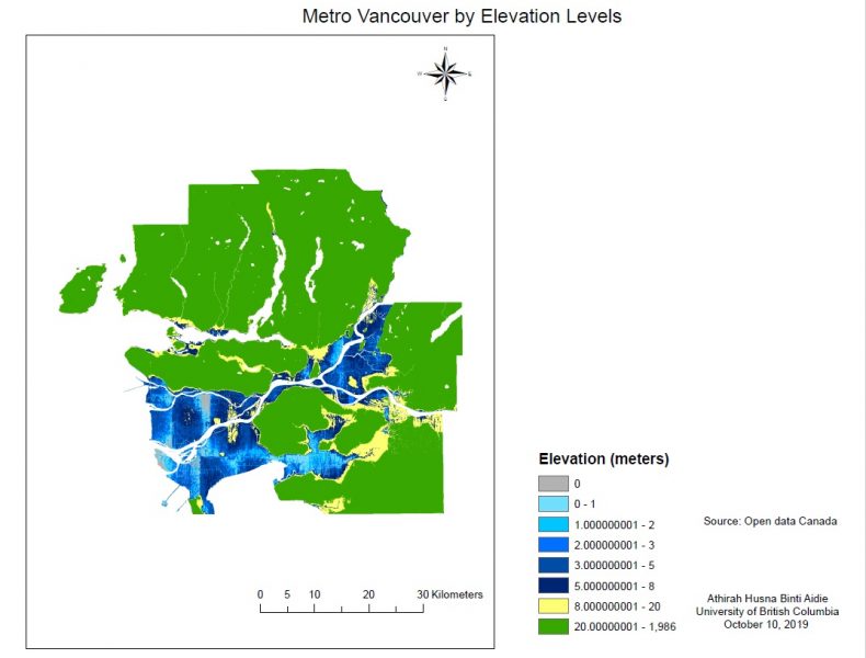
The first map that I created is a map showing the elevation of Metro Vancouver. I have problems adjusting the size of the map which causes the map to be quite small in the finishing product. However, after asking my TA, I found out that it was actually very easy and thus I will try to include that in my upcoming assignments. I also think that the shades of blue that I chose were too similar and hence, that might cause difficulty for other users to differentiate between two different elevation classes. Based on the analysis, 391 kilometres squared of Metro Vancouver are found to be located at an elevation of 5 metres and lower.
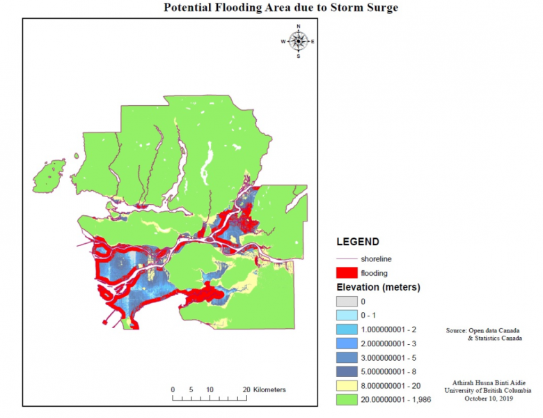
For the second map, we were assigned to create a map showing the potential flooding area due to a storm surge. I chose the flooding area to be red so that it can be seen clearly above the blue elevation layer. I made the elevations layer to be at 30% transparency so that the flooding area can be seen more clearly.
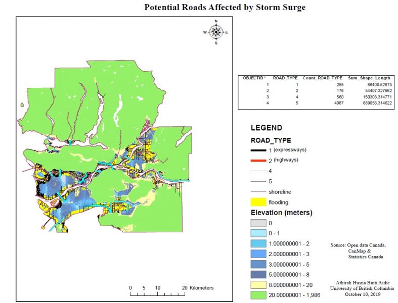
For the third map, we were assigned to create a map displaying the roads affected by the potential flooding area. For this map, I changed the colour of the potential flooding area to be yellow (from red) because the highways are assigned to be coloured in red and therefore changing the potential flooding colour to yellow will help users to see the roads more clearly. The map is still quite small which may cause errors to identify the roads affected by the storm surge. Analysis done shows that 138.9 km of highways and expressways would be affected in an incidence of a storm surge. I also included a table showing the road types and length of the roads that are found in the flooding area.
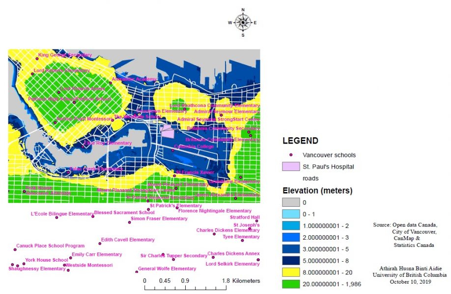
For the fourth map, we were assigned to create a map of False Creek Area, displaying the roads and schools there. This map is quite crowded due to the school names and the roads, so I tried to use very vibrant colours so that all information can be clearly visible on the map. In this map, school names, roads and elevations were included. Analysis done shows that no school is located in the potential flooding area, which indicates that all schools in False Creek Area are at a lower risk during a storm surge.
I find the buffer tool in ArcGIS to be very helpful in analysing spatial data that deals with finding an area which is an outcome of overlapping focused features.
As you can see, my maps at this stage are still not that visually appealing (in other words, hideous) and hopefully, my mapmaking skills will improve as the term progresses.
Accomplishment Statements:-
1. Gained basic skills in using ESRI ArcGIS Software (designing map layout, legends and other items, converting raster to vector, changing projections and fixing misaligned spatial data)
2. Used the buffer analysis tool of ESRI ArcGIS which overlapped 5m-and-below elevation areas and 1km-and-below-from-shoreline areas to create a map showing the danger zone during a potential storm surge in Metro Vancouver.
3.Identified items required to be included in a map (legends, north arrow, scale bar, title, data sources) to make a comprehensible and informational map.
That's all for now, thank you!
Accomplishment Statements:-
1. Gained basic skills in using ESRI ArcGIS Software (designing map layout and legends and other items, converting raster to vector, changing projections and fixing misaligned spatial data)
2. Used the buffer analysis tool of ESRI ArcGIS which overlapped 5m-and-below elevation areas and 1km-and-below-from-shoreline areas to create a map showing the danger zone during a potential storm surge in Metro Vancouver.
3.Identified items required to be included in a map (legends, north arrow, scale bar, title, data sources) to make a comprehensible and informational map.