Hi everyone!
The scenario given in our fourth lab: We were a data journalist at Globe and Mail (Canada's national newspaper) who was given a task to create publishable maps to accompany an article on rental housing in Metro Vancouver compared to in Montreal.
Personally, this is my favourite lab assignment and I truly enjoyed working on this assignment.
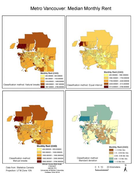
In this lab, we were required to make three maps. The first one is a PDF document of four similar maps displaying the median monthly rent in Metro Vancouver but with different classification methods used in each map- natural breaks, equal interval, manual breaks and standard deviation.
Natural breaks classification (also known as Jenks) is a default classification method in ArcGIS. The advantage of natural breaks is that this method divides the data into classes that are statistically different from each other as it minimises differences within a class but maximises differences across classes. Thus, this method almost accurately reflects the underlying data distribution.
Meanwhile, the equal interval method places boundaries between classes at regular intervals and it is great in the way that the classes appear logical and also easier to interpret. However, this method does not really represent the data distribution and can result in empty classes or classes with too many values.
As for the manual breaks, this method allows the map creator to set the class boundaries using external criteria such as housing affordability cutoff and the poverty line which are more familiar-looking to the readers. This method allows readers to easily understand the class breaks. However, this method may obscure the underlying distribution of the data.
The final one, the standard deviations classification method make classes become centred around the mean values. This allows readers to see which areas have a monthly rent higher or lower than the average. However, this method is not suitable for data that is not normally distributed.
These different classification methods can change the interpretation of a certain area to be either expensive or cheap in the eye of the readers. This also shows that different classification methods can highly influence the data presentation.
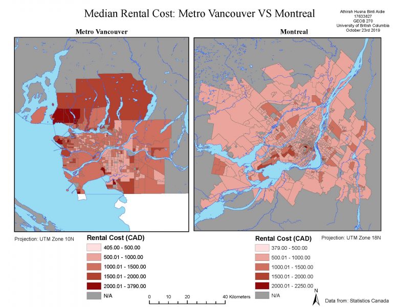
The second map made shows the comparison in median monthly rents between Metro Vancouver and Montreal. Median is used instead of average because if there are anomalies in the data (i.e., in this context, rents that are way too high or way too low), it will not affect the representation of the data taken (i.e. the middle value, median, is still an excellent representation of what is most likely the rental cost at that certain area). Meanwhile, anomalies can affect the mean value so the mean might not be a great representation of the monthly rental cost of that certain area, hence the data will be less accurate. This data was taken from the 2016 Census managed by Statistics Canada. Although only 20% of Canada's population was required to fill up the long form containing questions on rental housing and affordability, Statistics Canada has carefully chosen households that would represent the condition of a certain neighbourhood area and therefore, the census data can be considered to be accurate and reliable. However, there might be an error in the data as the data does not take into account multiple people with income who live in the same house (i.e., individually, the people need to pay a much cheaper rent compared to if the rent was not divided between the tenants). Besides, there might be some household that leases their basements but this data was not recorded in the census. The no-data areas are areas where the data have been suppressed for privacy reasons since the areas only had less than 40 respondents.
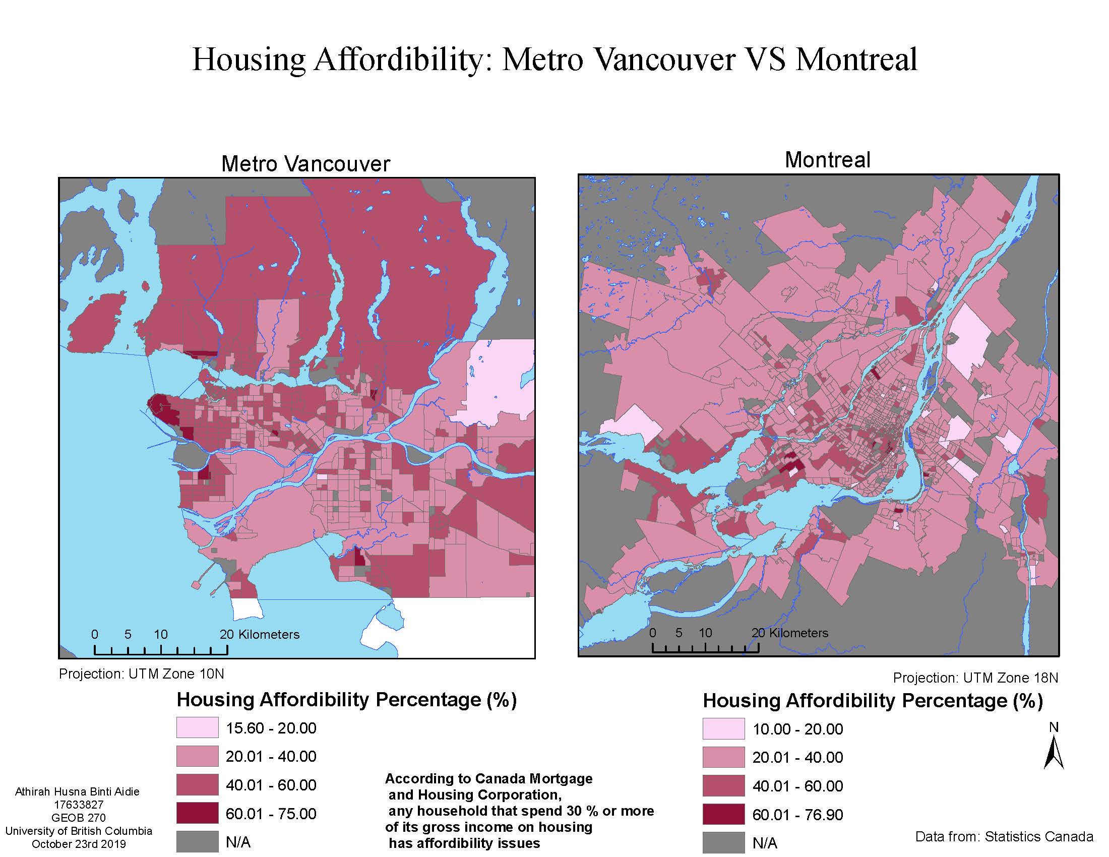
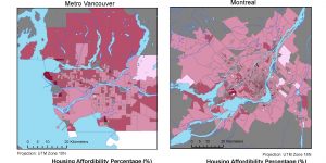
For the third map, we were tasked to display the housing affordability percentage in Metro Vancouver compared to in Montreal. The housing affordability percentage is measured by taking the ratio of the rental cost of the house to the total income of the household. According to Canada Mortgage and Housing Corporation, the cutoff for housing affordability percentage is 30%- any house with more than 30% is considered to be unaffordable. It is a better indicator of shelter affordability compared to the monthly rent of the shelter because more developed cities may have a higher cost of living compared to smaller towns but people living in these cities usually have a higher income than people who work in smaller towns. Hence, housing affordability percentage is a fairer way to compare between two different places or cities.
From this task, Montreal is proven to be more affordable to live than Metro Vancouver as almost half of Metro Vancouver falls above the 30% cutoff. However, I need to mention that strangely, in this task, we were asked to break values at 20% interval and therefore, we were unable to clearly show houses that are below the 30% and above the cutoff.
According to Liveable City Organisation, although affordability is one of the factors of a liveable city, there are other factors that influence the livability of a city such as robust neighbourhoods, accessibility and sustainable mobility, a diverse and resilient local economy and vibrant public spaces which I believe Vancouver strives at, which is no wonder Vancouver was the most livable city 7 times in a row according to the Economist Intelligence Unit (EIU) from 2004 to 2010.
Here are my accomplishment statements:-
1. Learnt how to search for and download shapefile and tabular data from UBC Library website and University of Toronto census data site
2. Learnt how to display a variable using different classification methods such as manual breaks, natural breaks and standard deviations
3. Combined spatial data and spatial data by identifying the common join attribute in both data and using the ESRI ArcGIS tool join and relate to combine them.
4. Used ratios and percentages to compare housing affordability between two cities (Metro Vancouver and Montreal)
5. Learnt about Canadian Census Data terms such as Dissemination Areas and Census Tracts
That's all for now, thank you!